TriMet, Green rail
Trains and buses are integral to infrastructure. In Portland, Oregon, it’s truly vital to the flow of the city and as a service benefiting those across people groups. We all need to get somewhere. Public transportation also adds dimensionality to businesses and hot spots that one is able to access.
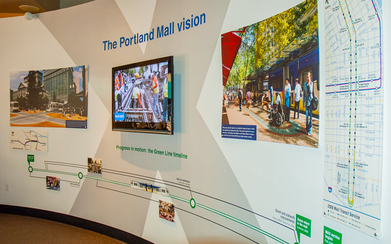
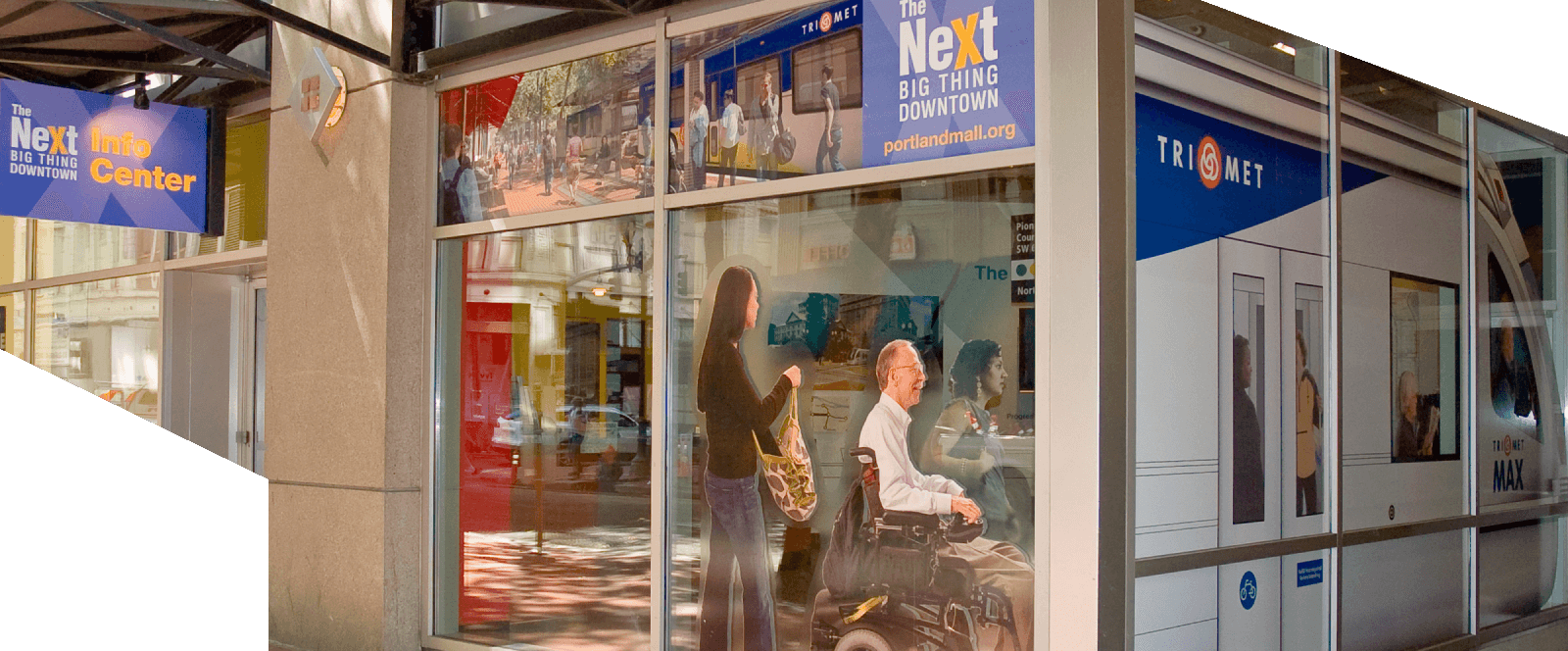
Wall exhibit and timeline at the Next Info Center
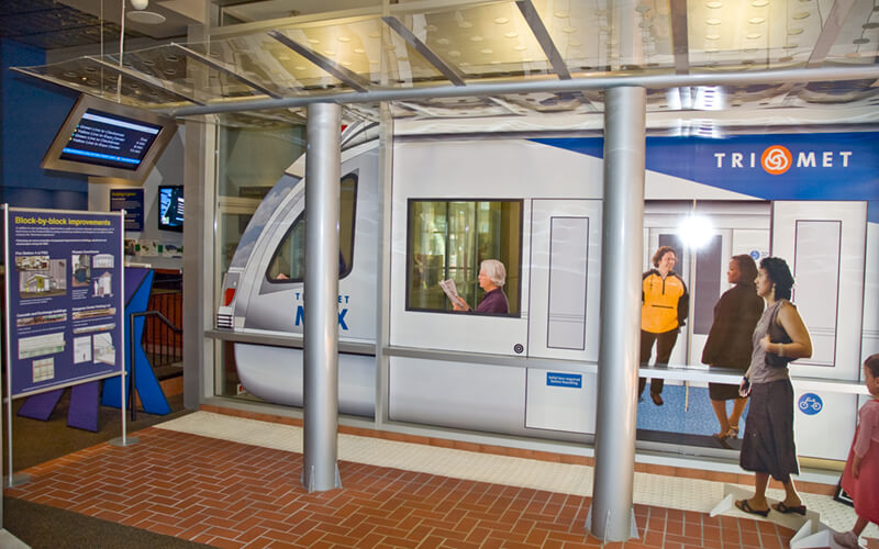
Window rendering, platform shelter setting, and schedule interface
That perspective became more inspirational as TriMet got rolling on the installment of its green line, prompting the launch of The Next Big Thing Downtown campaign. It would extend into the surrounding counties and share space with existing light rail lines. Portland reinforced public transportation because it made good on the state’s love of sustainability. Construction required an upheaval of city-based services due to the necessity of uprooting stops and abbreviating relied-upon schedules.
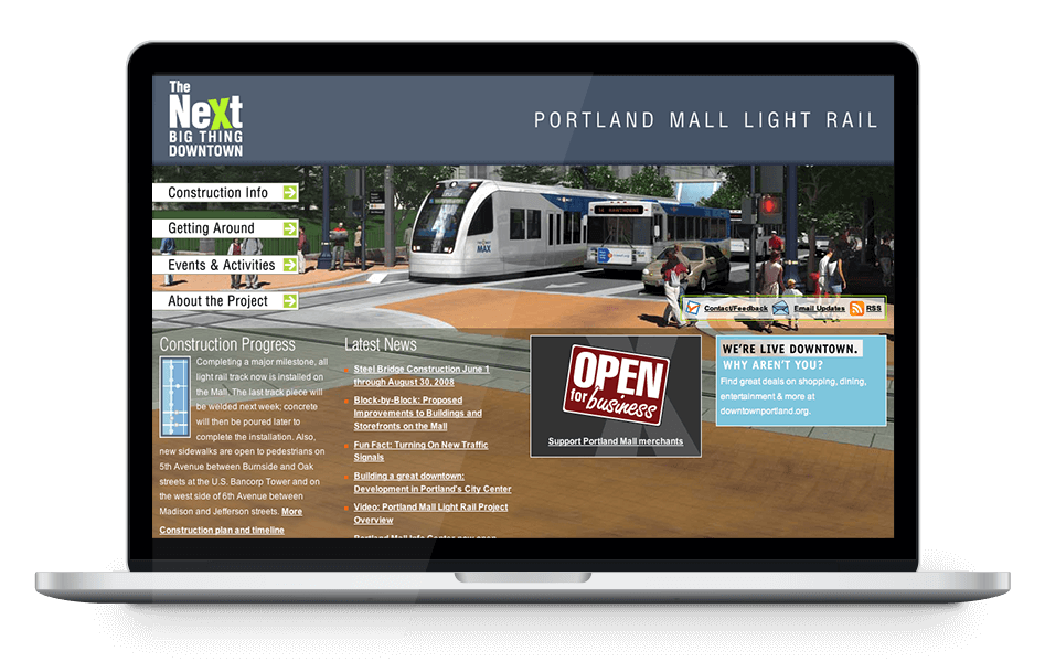
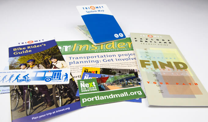
The general public and loyal riders needed to understand the big picture and access regular updates. A light rail installment hadn’t occurred in some time so our campaign materials acted as a refresher to the process. Along with a signage system and collateral, we educated the public about light rail and its benefits by establishing a web presence and pop-up shop. The Next Info Center was a comprehensive exhibit space with production timelines, history plaques, renderings of train schematics, and much more.
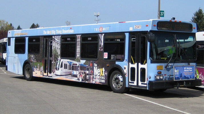
On the street, buses were wrapped with campaign elements to build excitement for renovated spaces. To address the confusion of relocated bus stops and traffic delays from construction, the web site was built to provide continual updates that would help riders plan their trips and commuters avoid closures. Additionally, promotional spaces were incorporated to offer deals and detours to businesses impacted by construction. Toward the end of the project campaign, I redesigned the system map and ticket vending machine interfaces to reflect the new rail route. This coincided with the schedule interface that was simulated in the info center’s shelter model.
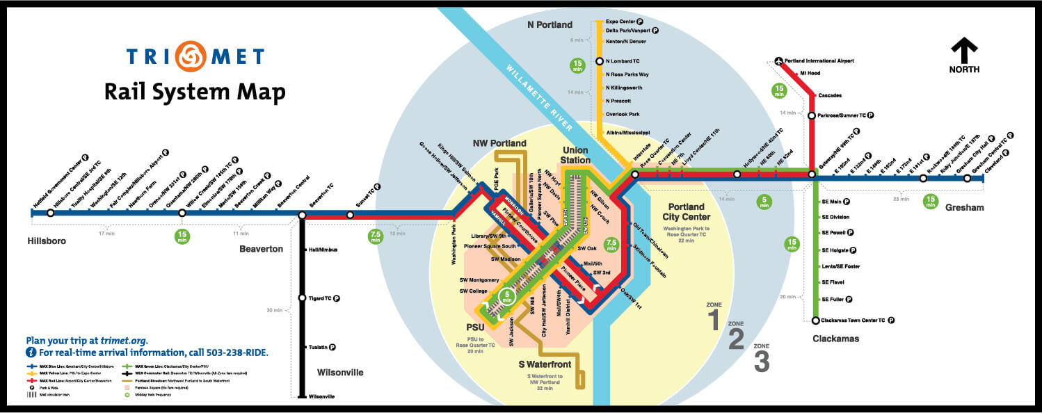
Rail system map redesign
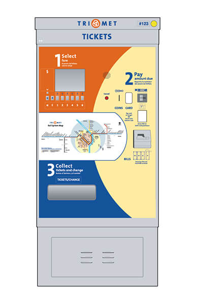
Interface display panel redesign
The campaign fostered ridership in a frustrating time, but also informed and built anticipation for an improved system that would bring even more of its metro citizens together in a green way.
