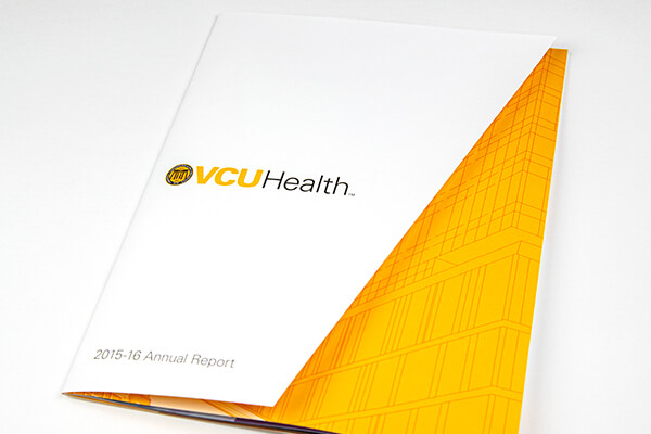
The health system at VCU underwent a major unifying change in 2014 and rebranded itself as VCU Health. In its new wave of reporting to the community and stakeholders, our team faced its first test in conveying the new brand values and identity traits. The belief was that VCU Health shouldn’t stray creatively in the first two years of annual reports.
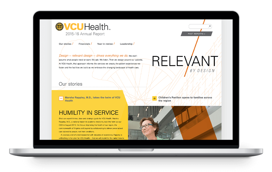
VCU Health annual report desktop
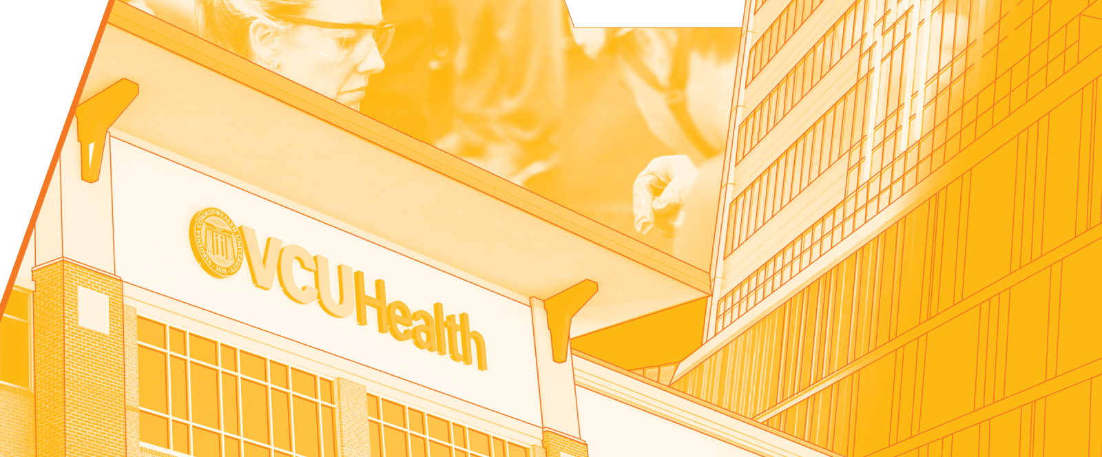
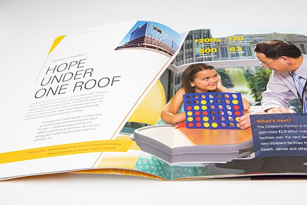
I used the theme – “Relevant by design” – and identity elements to art direct the reports for both 2015-16 and 2016-17. The first year we spared no opportunity to flaunt the dominant angle elements. Using their intersecting shapes, I outlined features from each story that would snap together like puzzle pieces in a collage that would be a foundation for both print and digital.
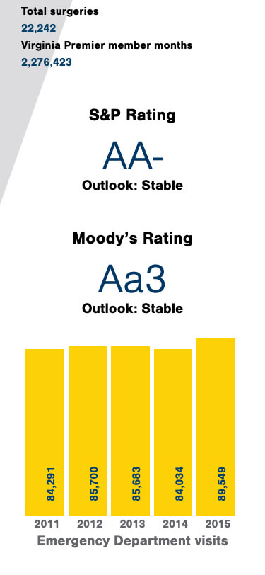
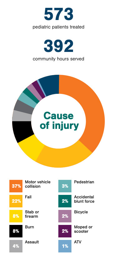
A scaffolding was already available for the web site so it was a matter of translating the new design system within context. Navigation was made bold and highly visible. Stories were the content users sought and the data was a close second. At the mobile level, each narrative was accessible from the homepage and offered a clear path to the following feature story. Facts and figures were modified for more clear consumption and employed via SVG for numeric transitions and the ease of future edits.
Implementing the brand faithfully and adjusting for a better user experience provided a new start and offered better data for future iterations of our digital reporting.